This zine is based on my long-term concept for my Digital Tools Layout & Design class. It talks about a personal experience of cause and effect I have had during my time in New York City as it is a place that is constantly in motion. My topic utilizes the theory of the domino effect and butterfly effect, showing both the short-term and long-term effects of an action.
ELEMENT COLLECTION:
Long-Running Statement of the Project:
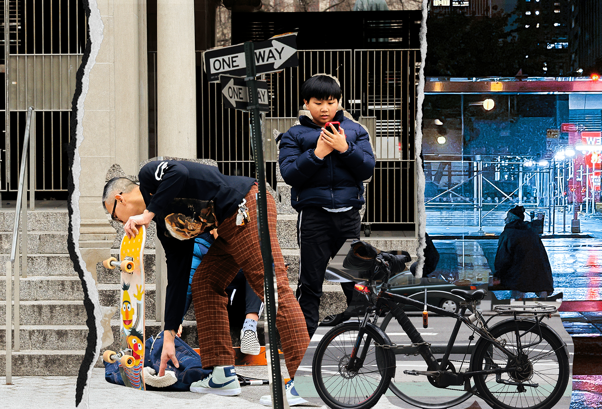
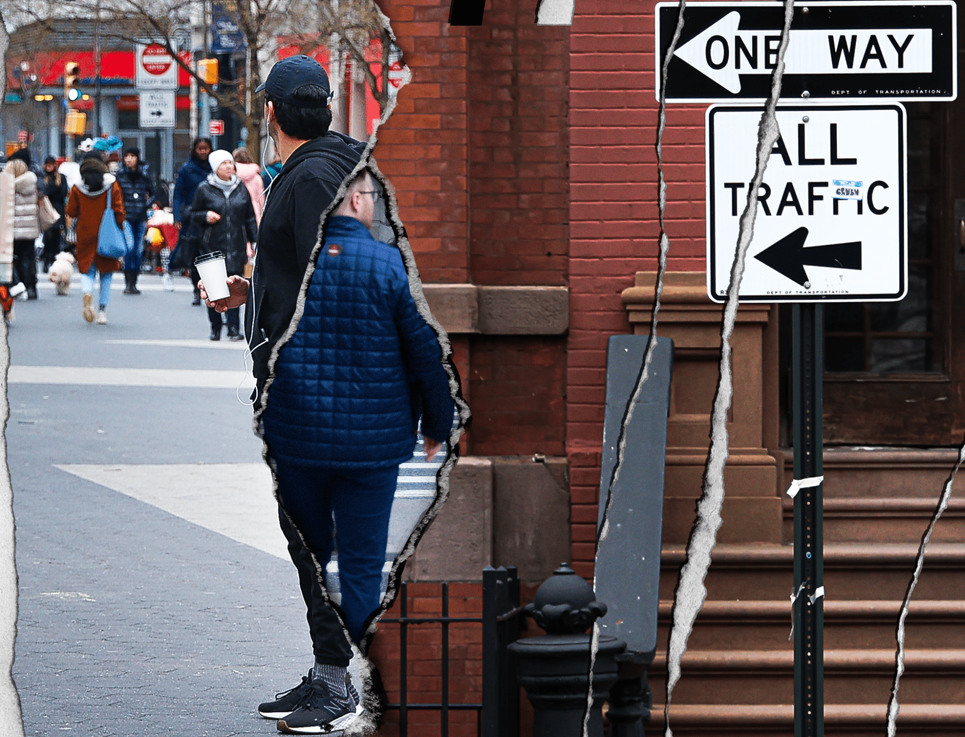
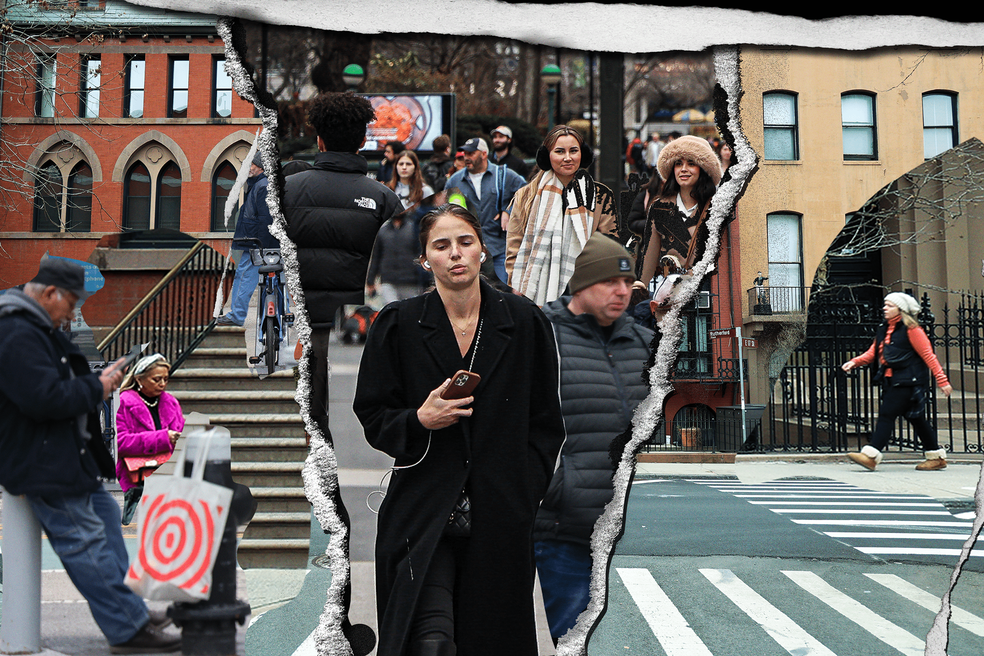
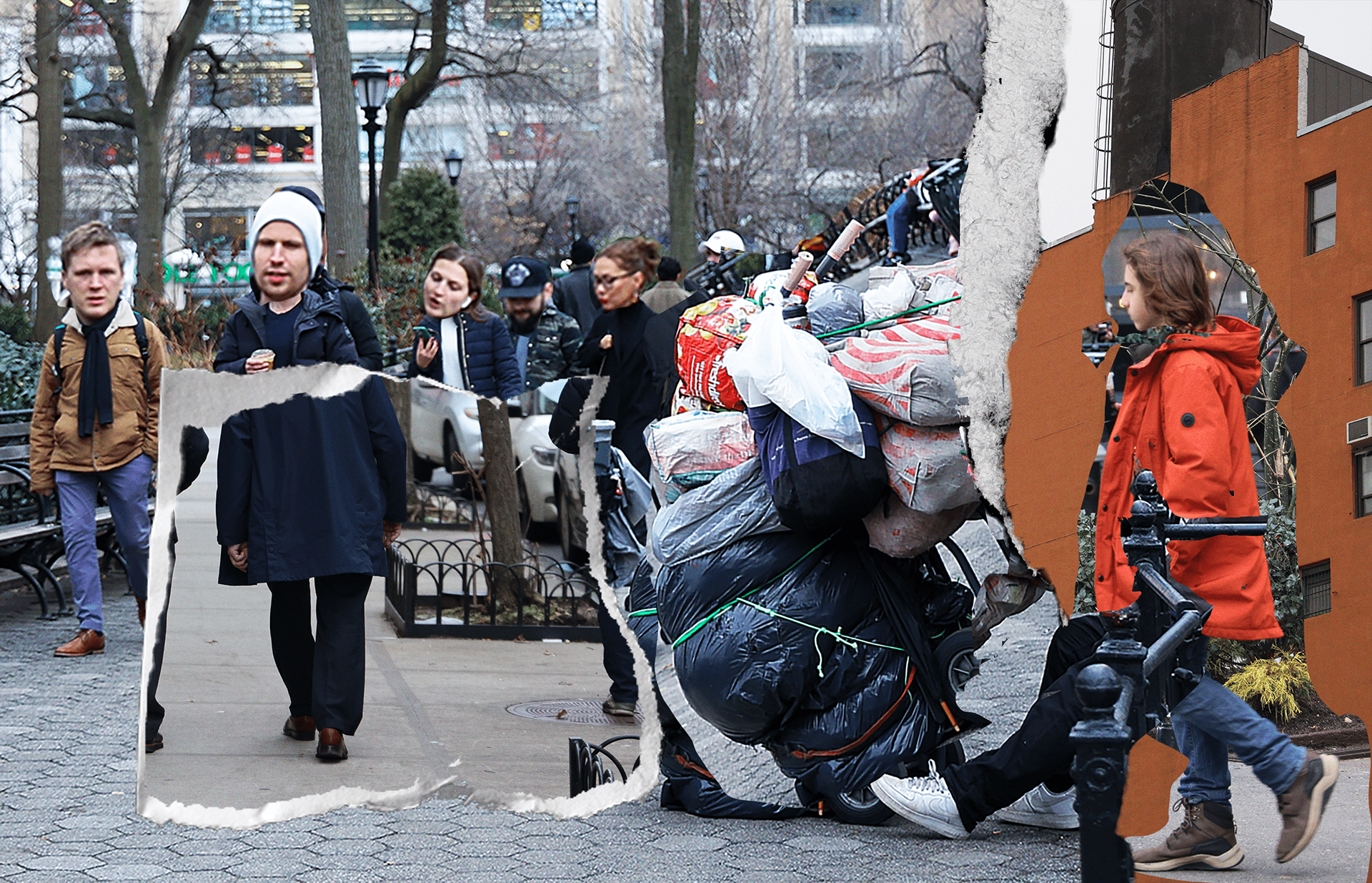
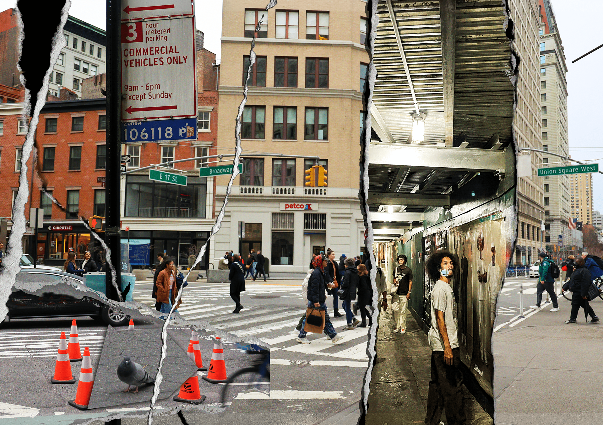
Once I decided on my statements, I created a library of photos I took around New York to use for the zine. Later, I edited the photos through Camera Raw in Photoshop to enhance the colors. I then created collages using these photos through photoshop.
Some Examples of Edited Images:
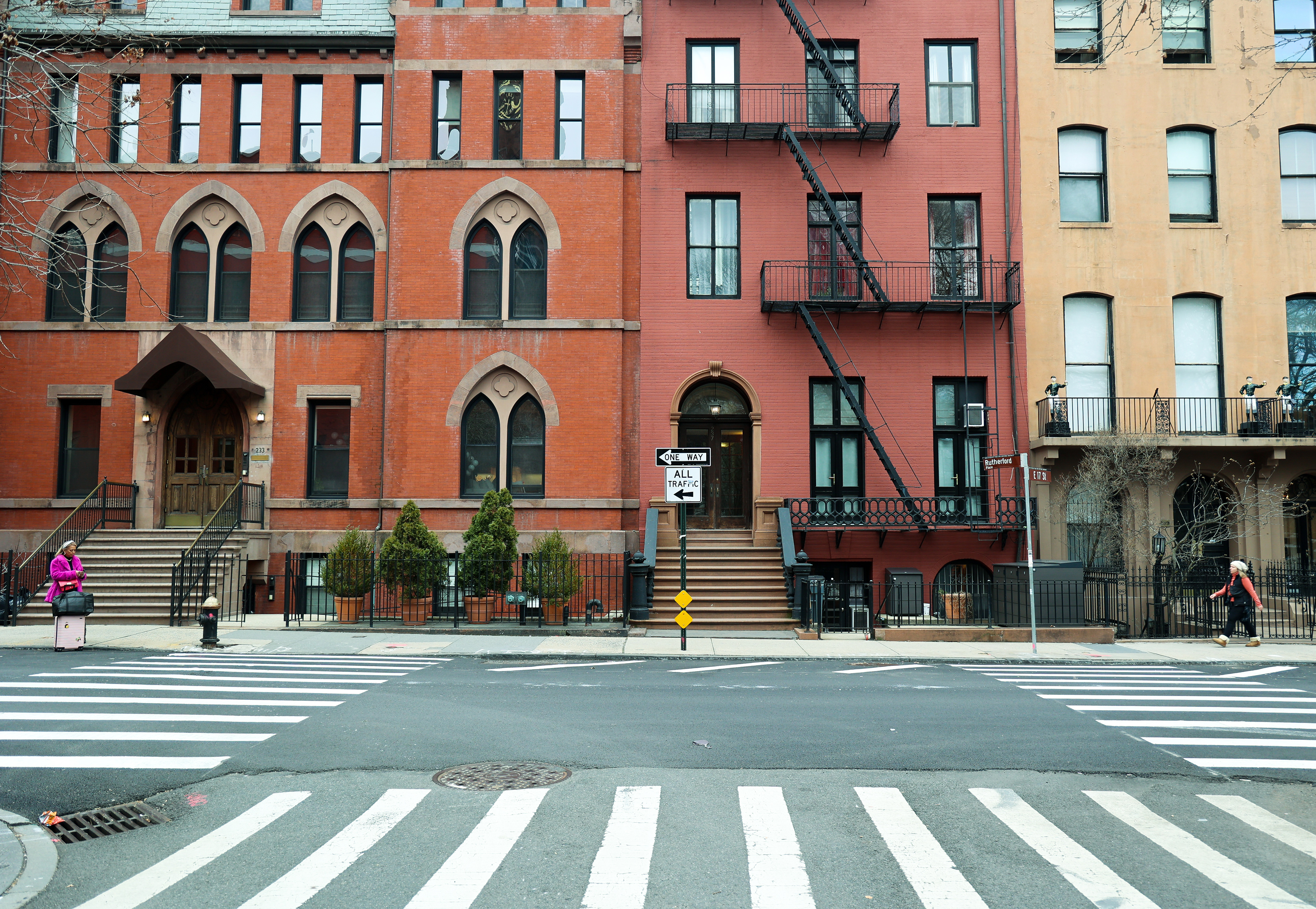
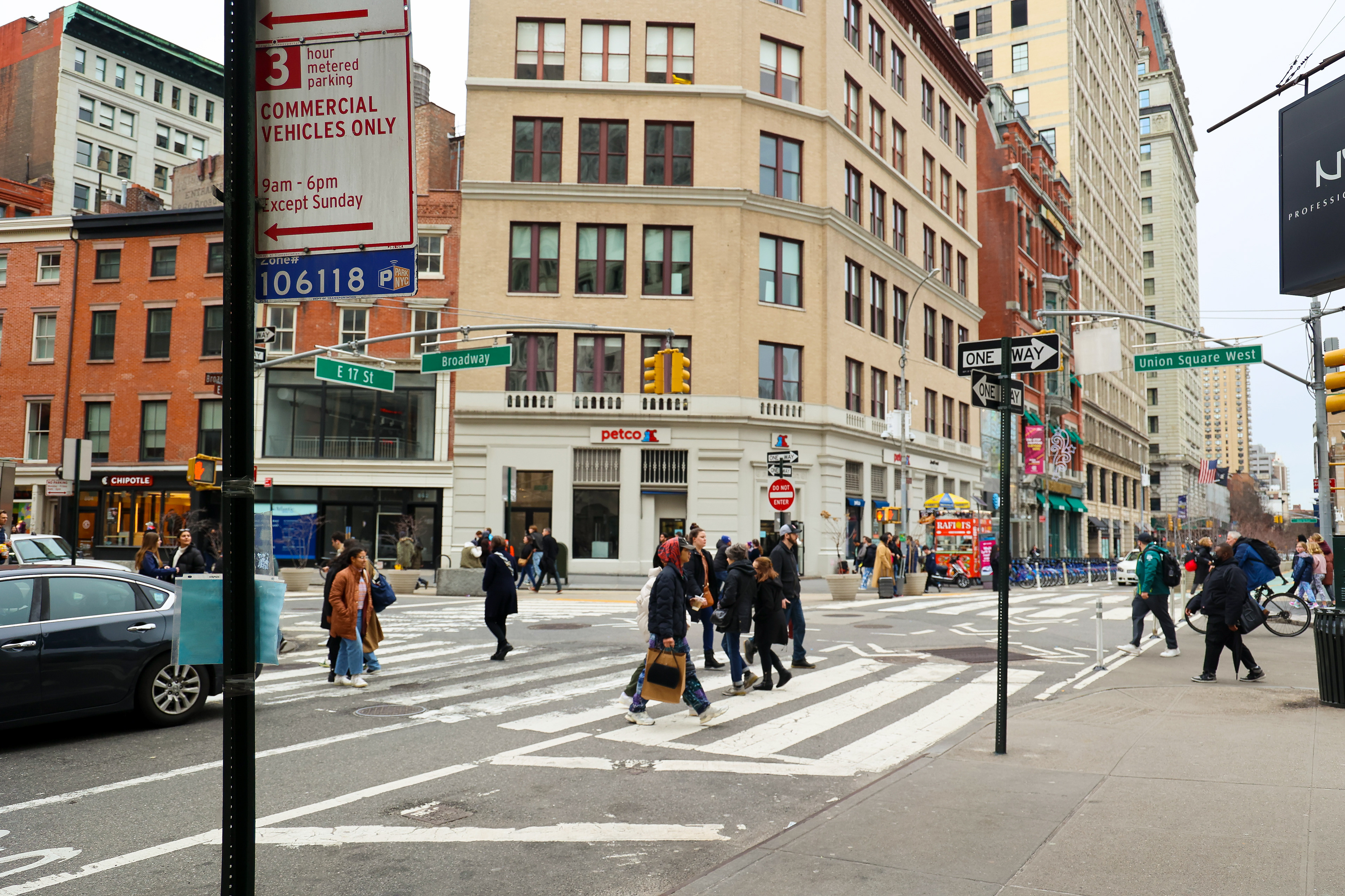
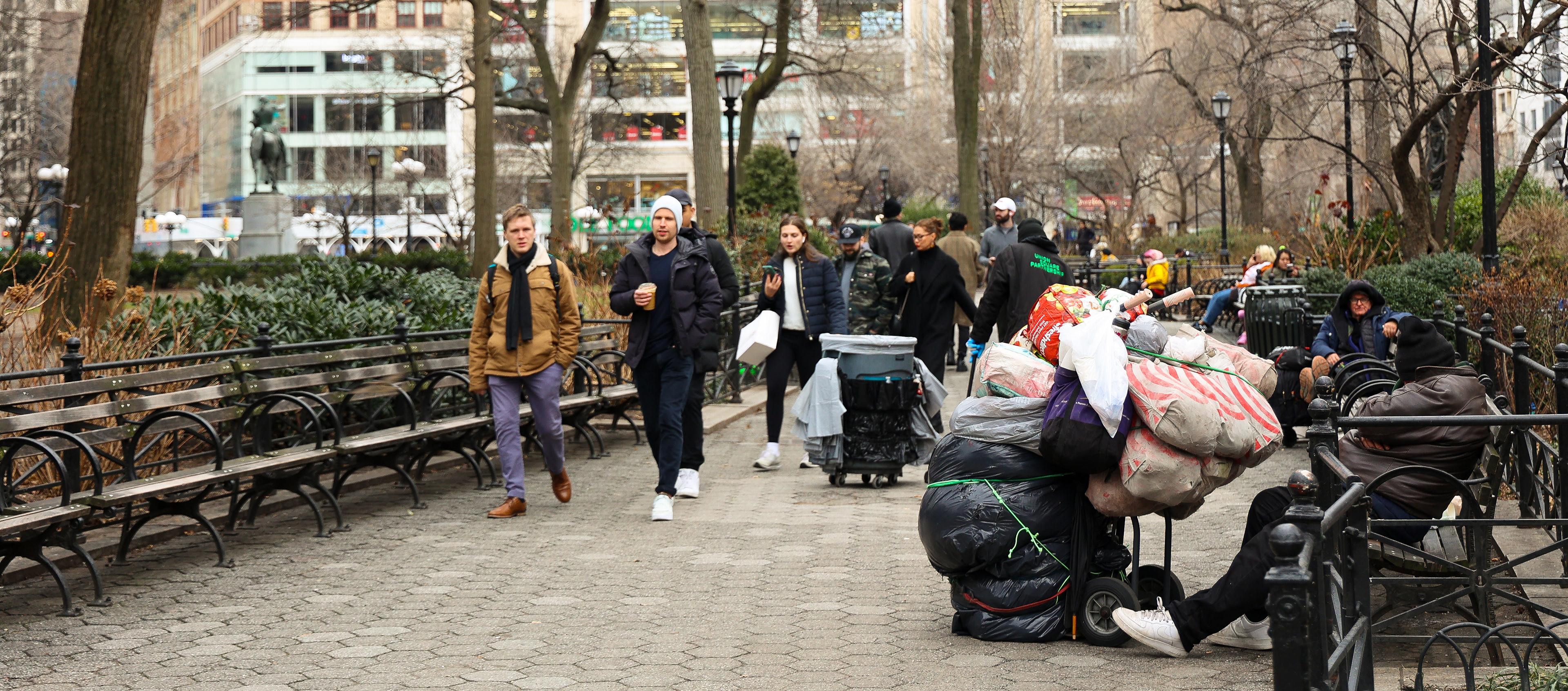
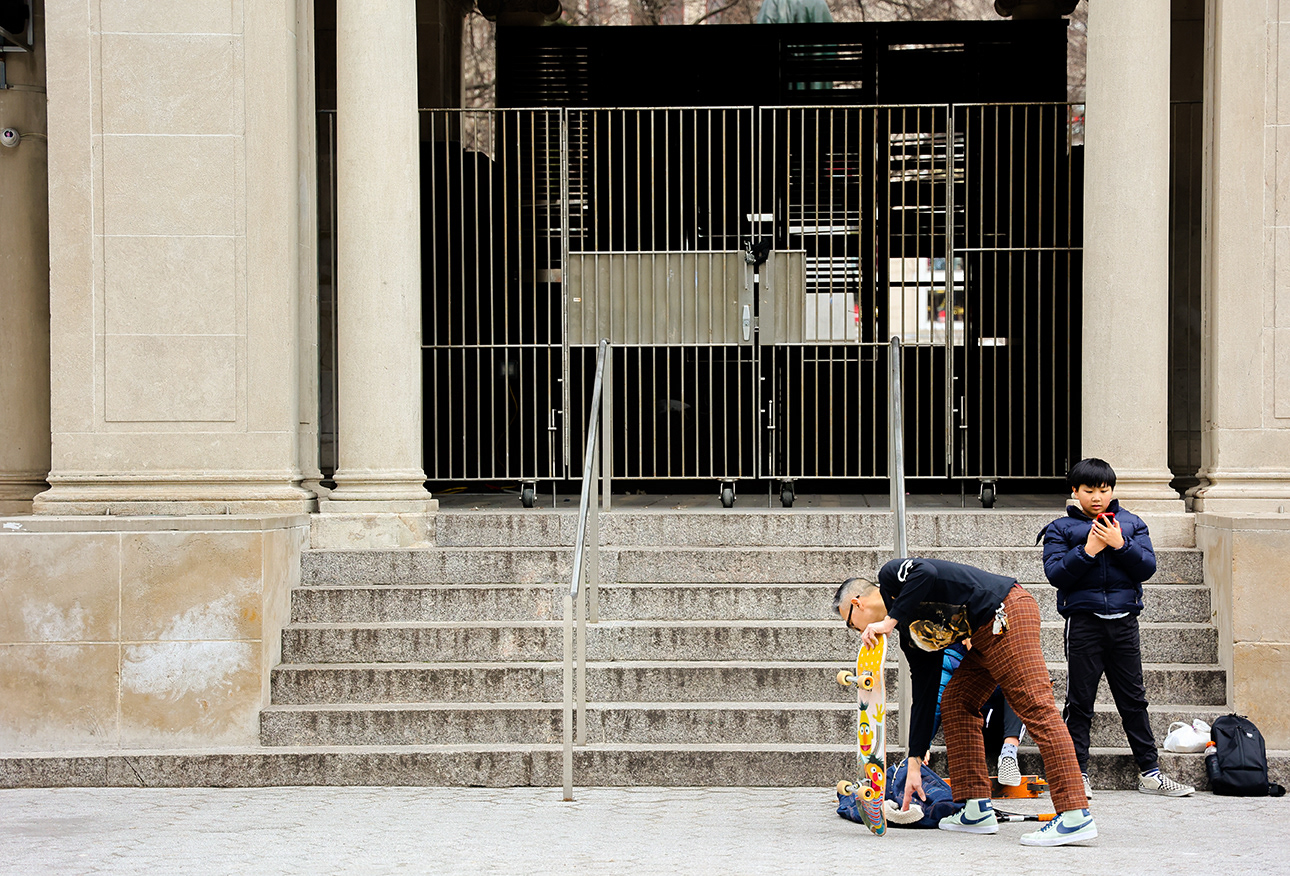


Collages:
Logo Creation:
To start this section, I divided the logo into separate sections: Graphic Symbol, Personal Name Logo, and Text Statement – all elements needed to create a piece as a whole
For this section, I focused on utilizing my concept of Dominoes and Butterflies, allowing me to use the named objects as a design. To do this, I made a few thumbnails of the designs and converted them to Illustrator. Eventually, I experimented with the symbols through several functions of the program to create variations. For the text, I used placeholders as a way to see the work more clearly.
Thumbnail/Variations:
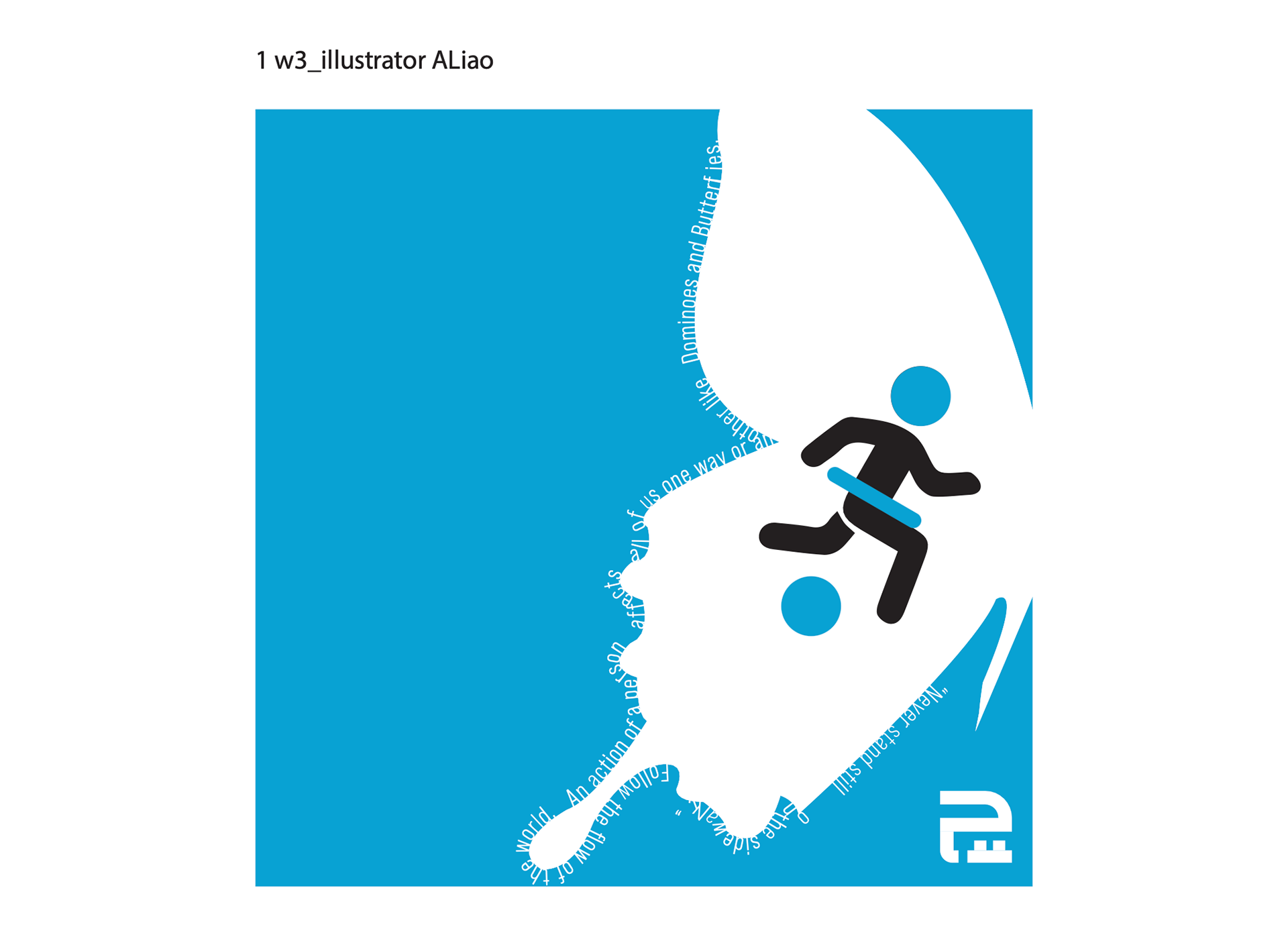
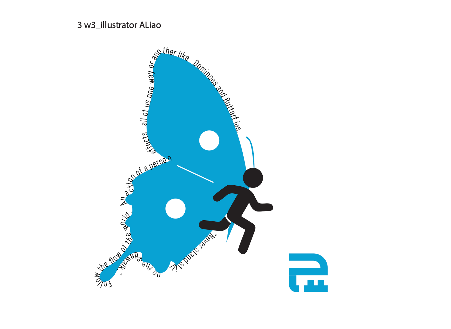
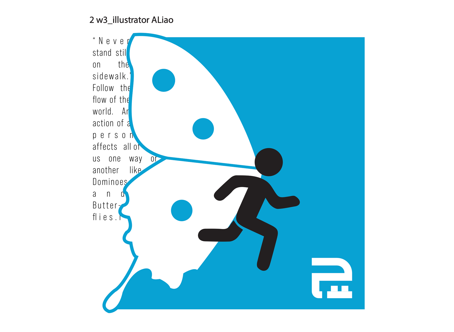
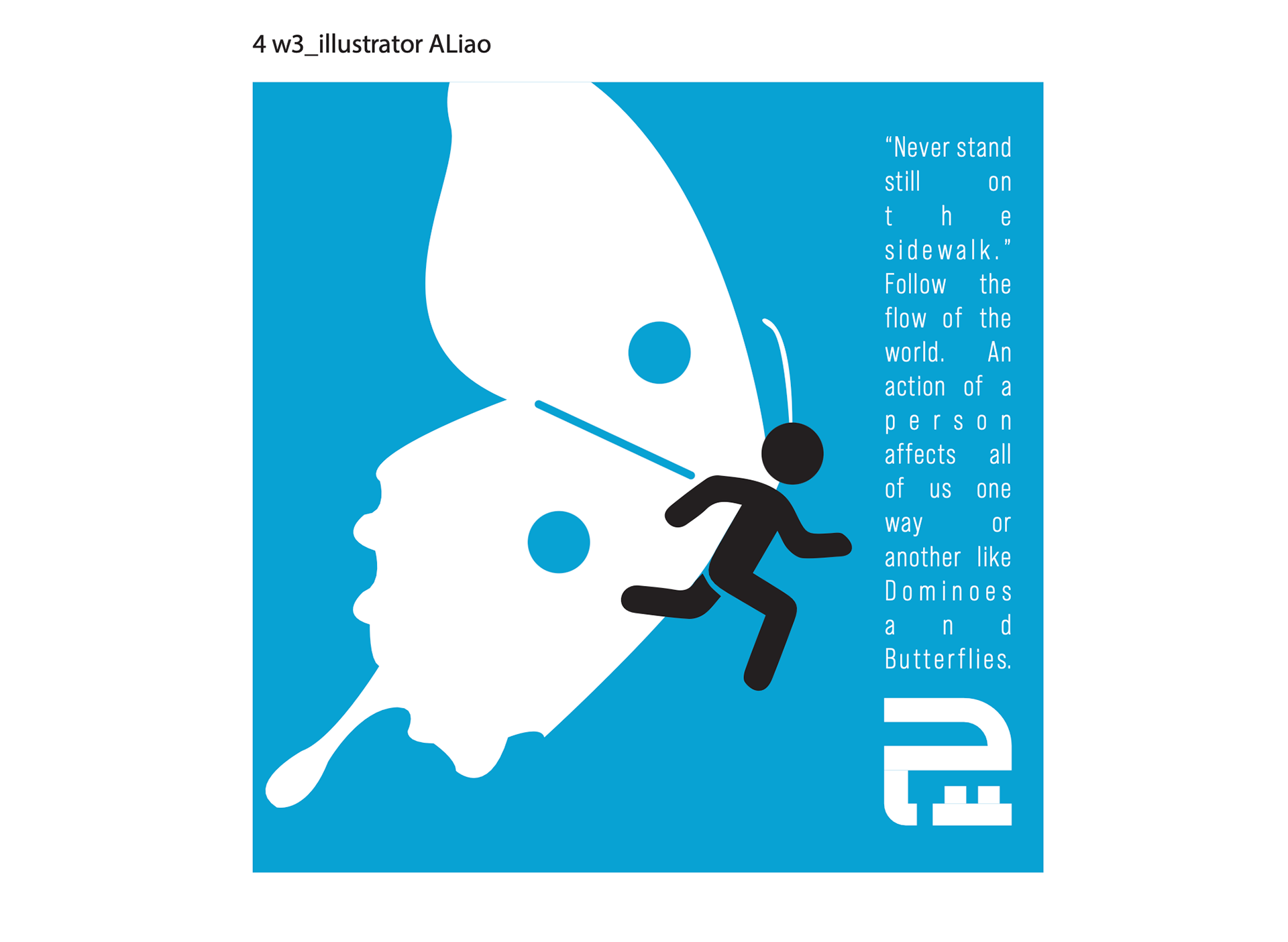
Text Statement: I decided to condense my overall written statement to a simple statement that generalizes the whole concept of the design. – “Never stand still on the sidewalk.” Follow the flow of the world. An action of a person affects all of us in one way or another like Dominoes and Butterflies.
Eventually, I decided to create a newer variation to give the simplified characters more unique features.
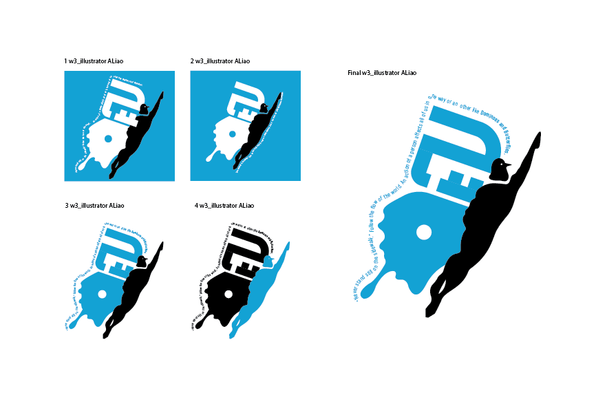
Variations + Selection
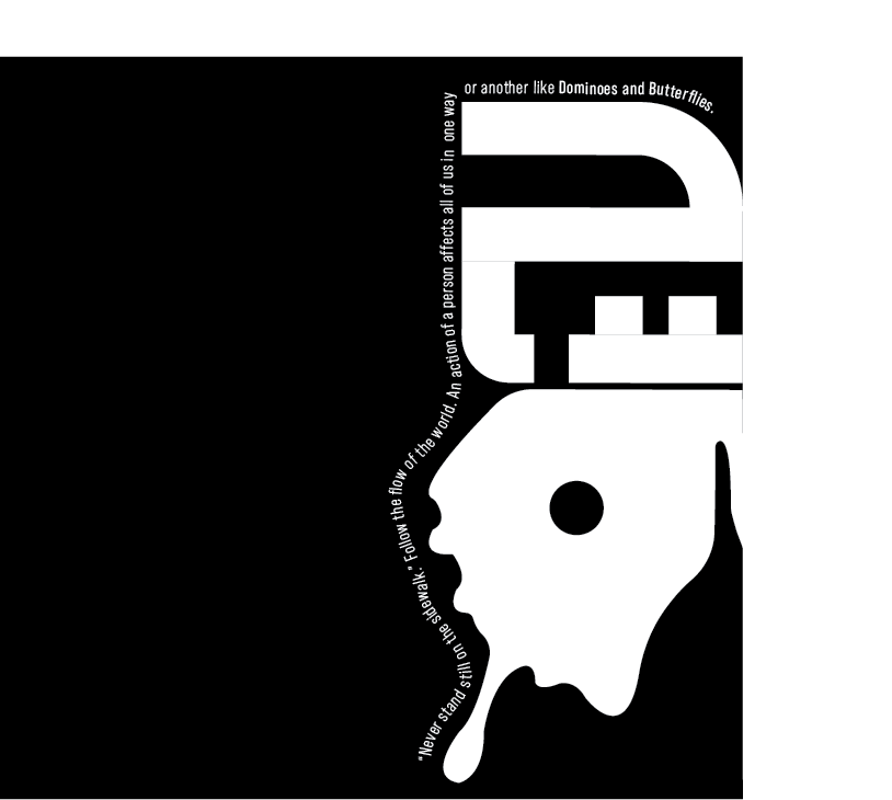
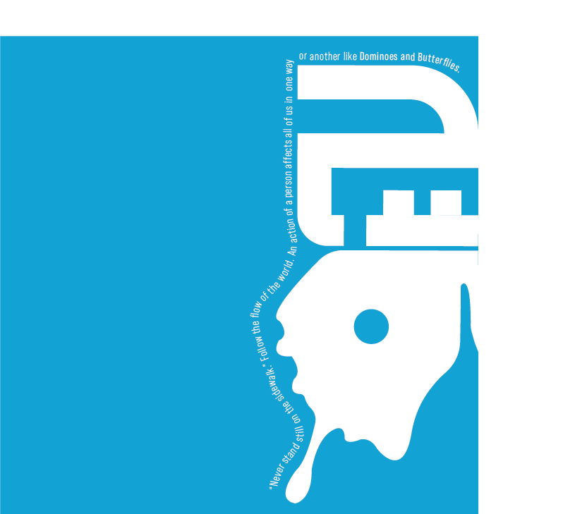
After receiving feedback, I focused on negative spacing and lettering to finalize my logos and further simplify the design. I created variations of colors and finalized the B/W portion of the logo with blue being the main color.
Final B/W and Color Logo Design:
B/W
Color (Can be Altered)
ZINE PROCESS:
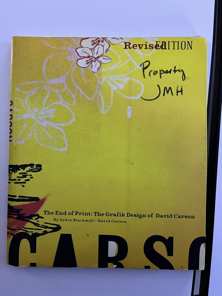
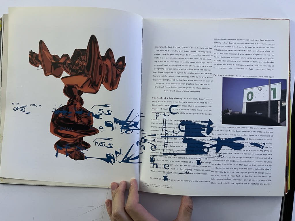
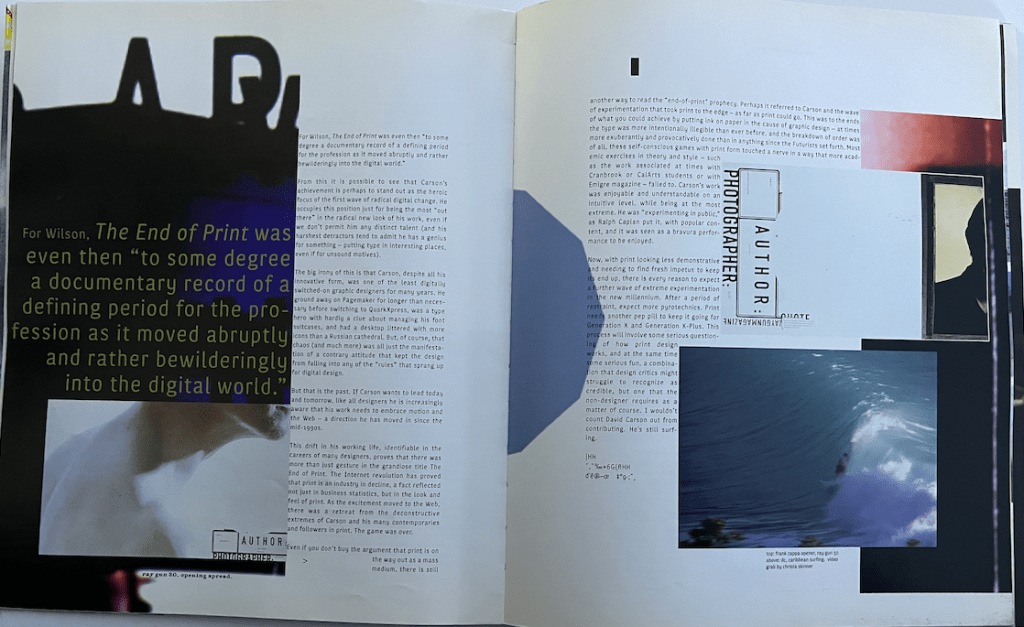
To start off the design process, I collected various references through Pinterest. I also took inspiration from layouts in the David Carson book and sketched out a draft based on the references I collected.
First Draft:

Refined Sketches + Journal Notes:
Afterward, I made some revisions to the sketches to simplify the designs so that the images within the pictures are highlighted more than the graphic images. I mixed in designs combining both replication and inspiration from the resources to create my zine.
B/W to High Contrast Draft
I first started off with a black-and-white rendering of the piece to see the layering of each design element in Indesign. After designing a few pages, I moved on to high-contrast colors to examine any flaws in the layouts.
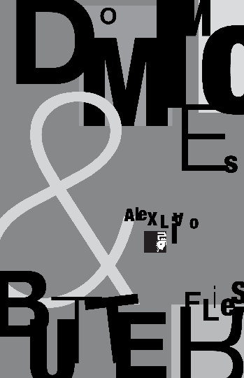
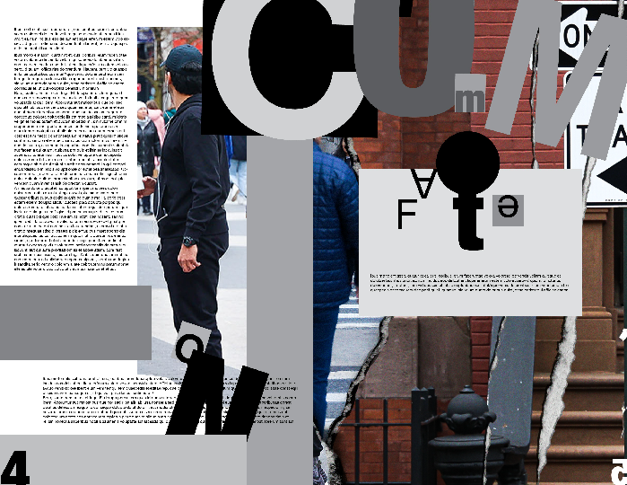
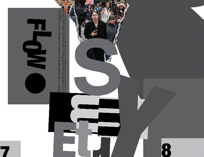
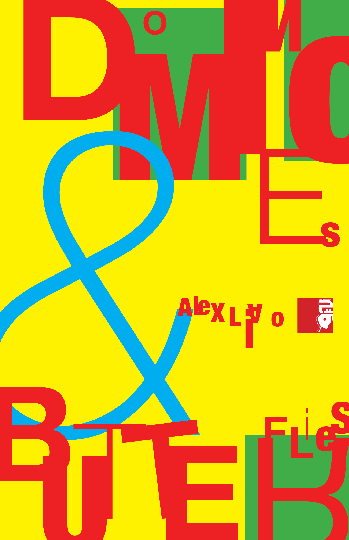
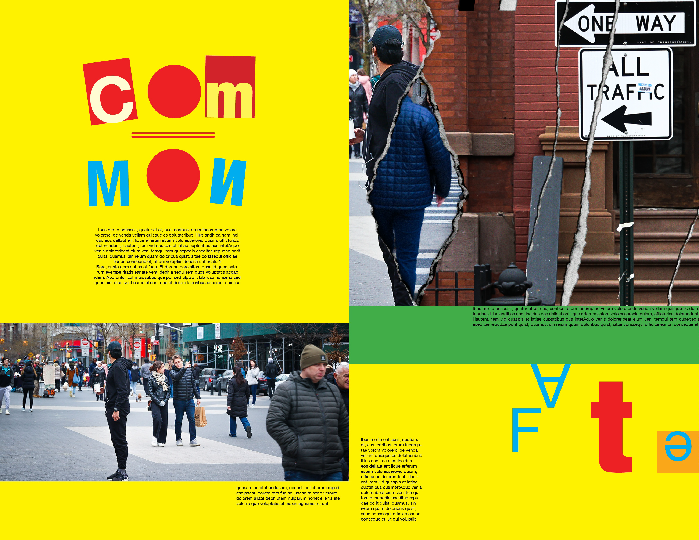

I managed to find a few flaws in the coloring and made a few revisions with a more simplified color contrast. I finished the other pages and created more graphical elements.
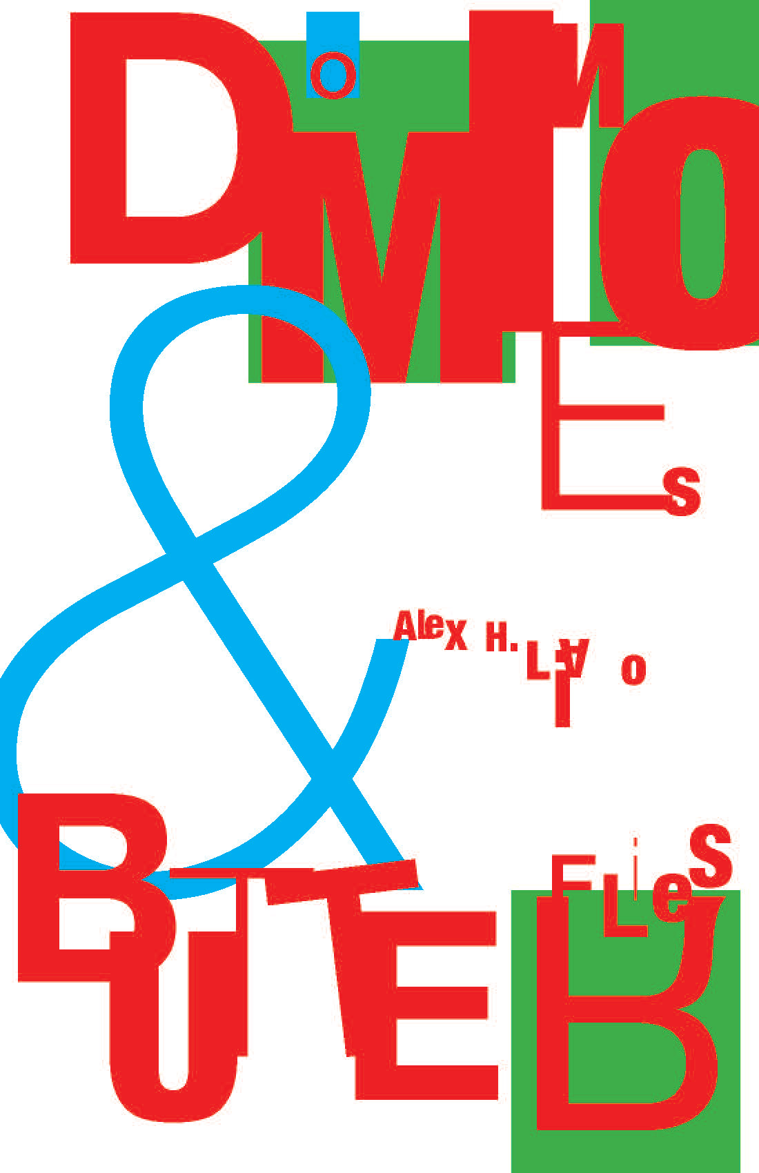
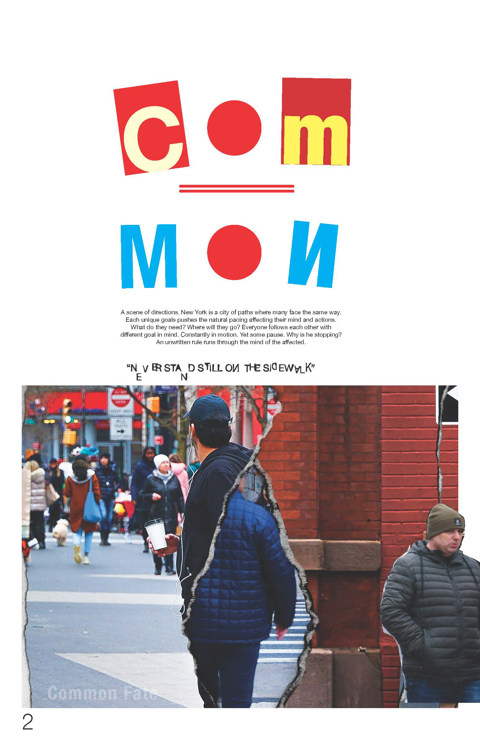
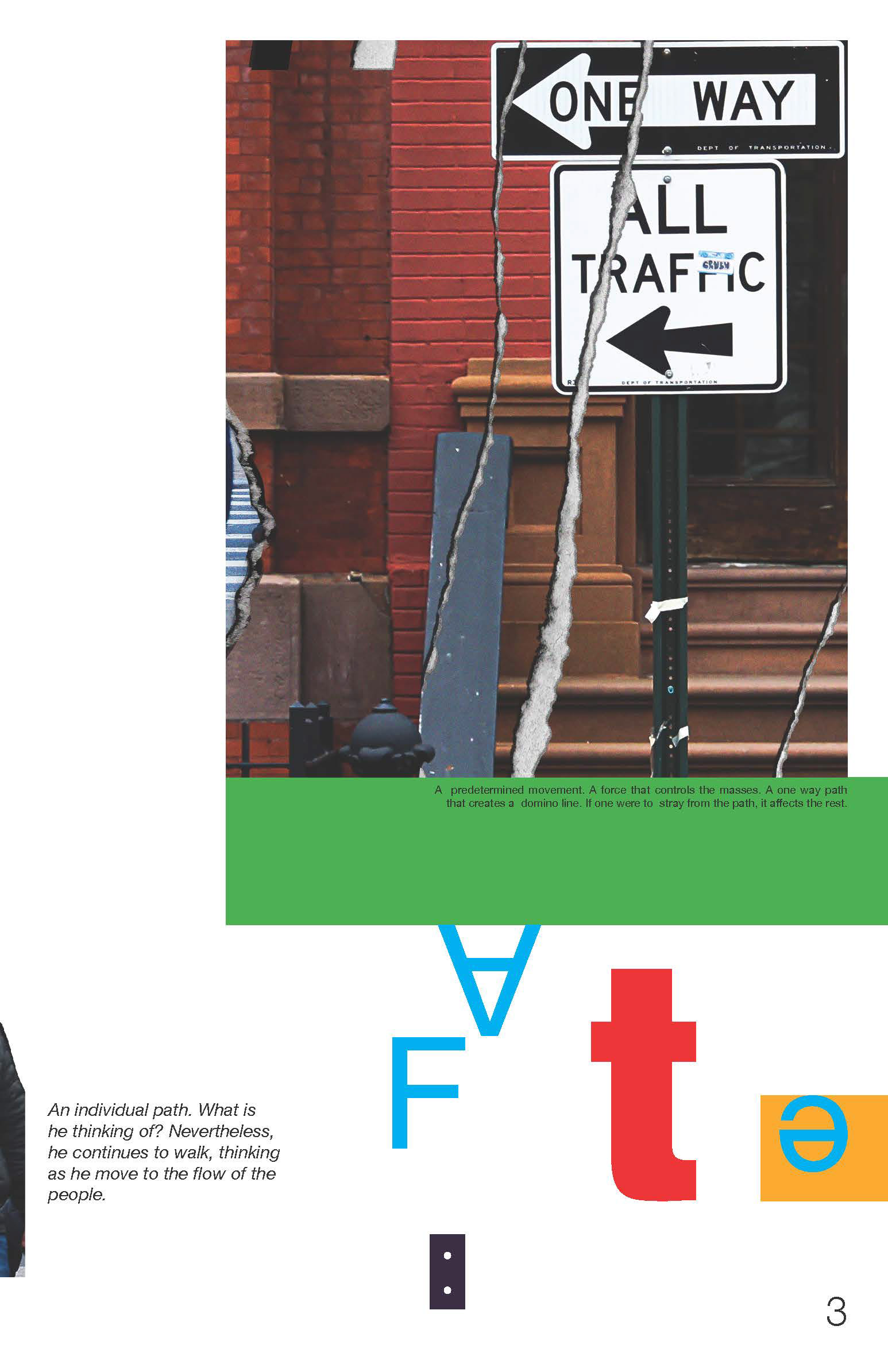
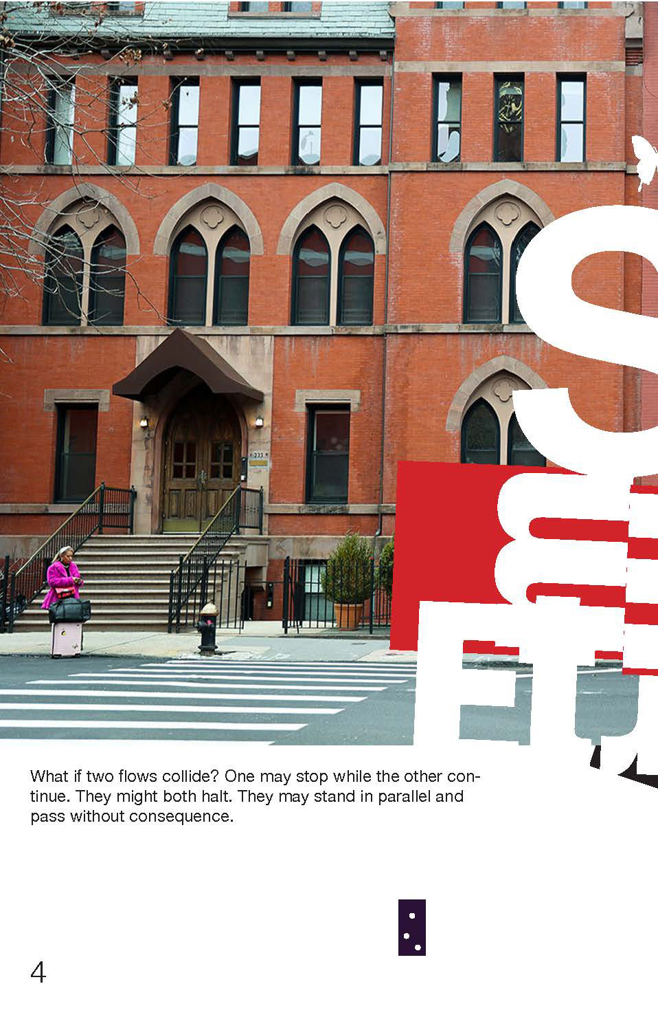
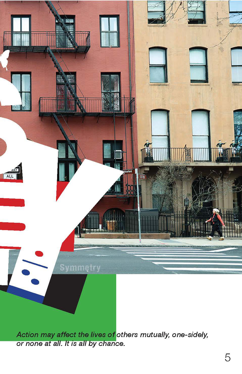
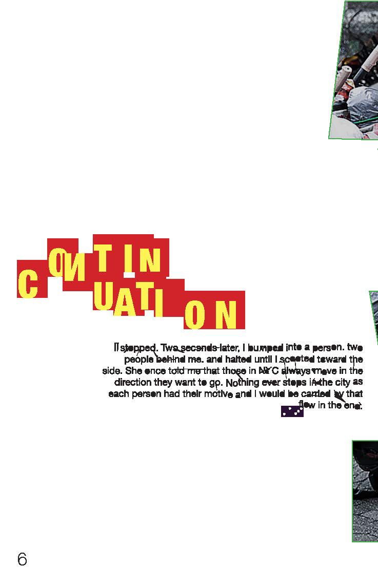
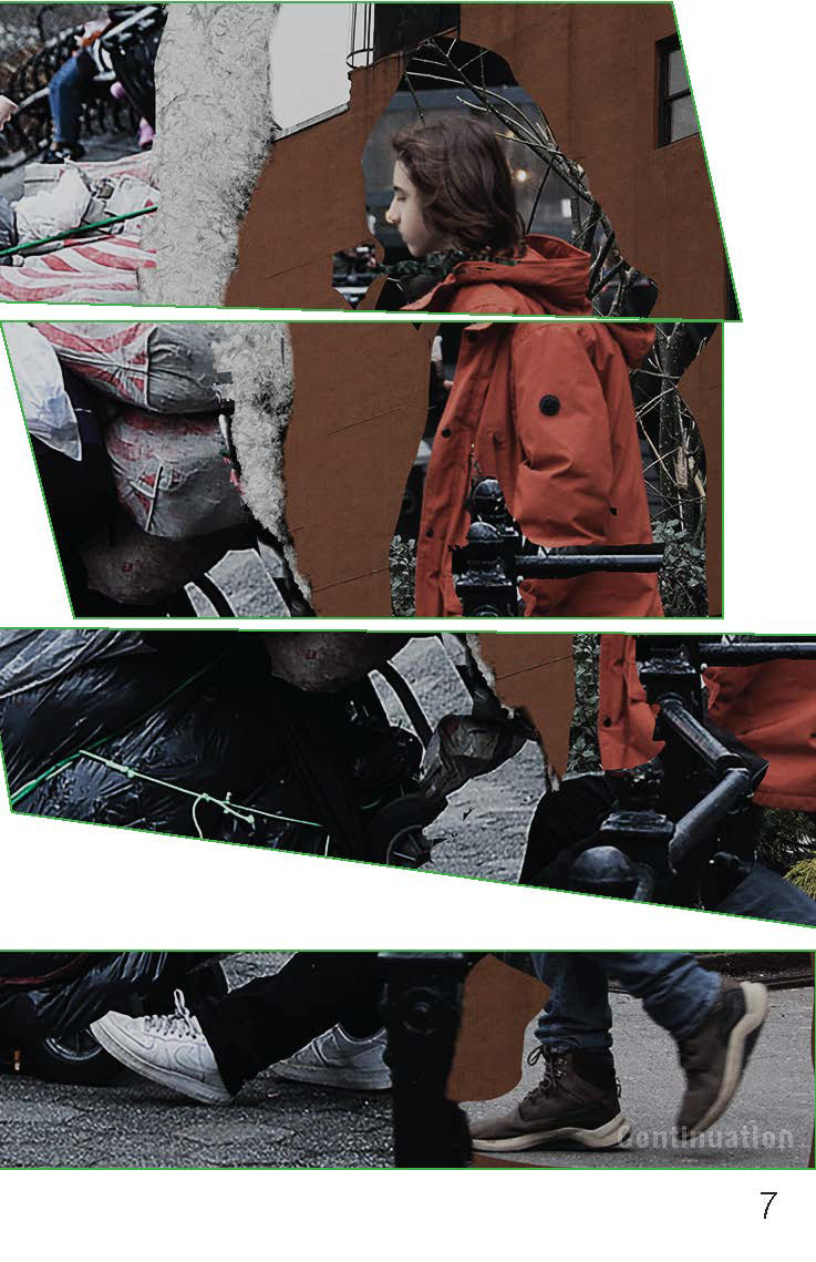
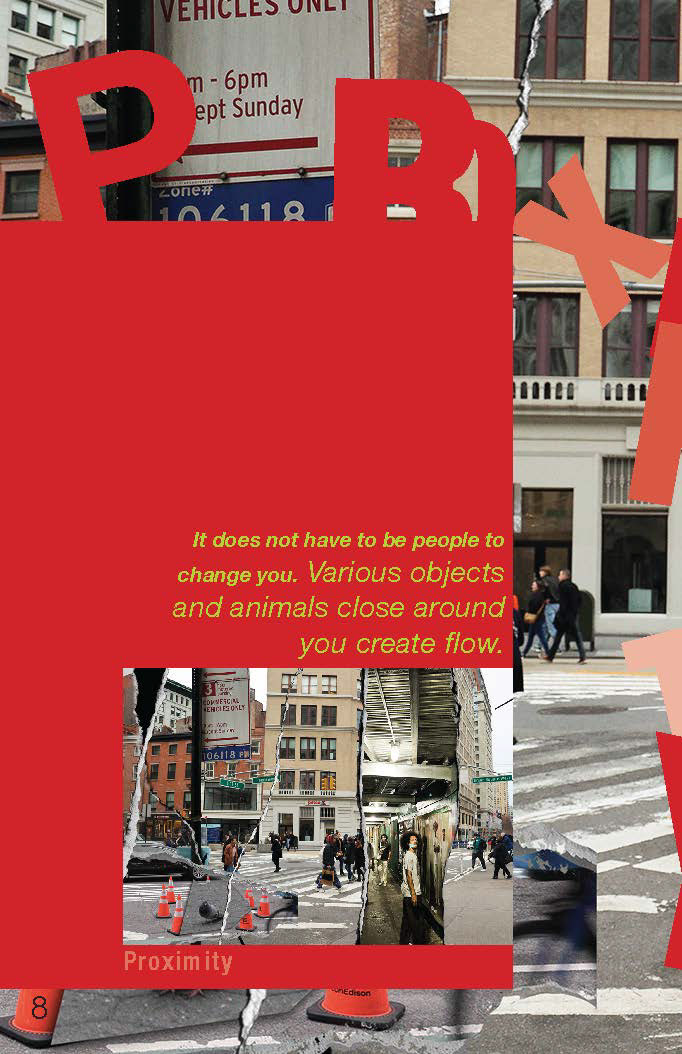
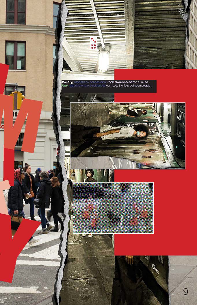
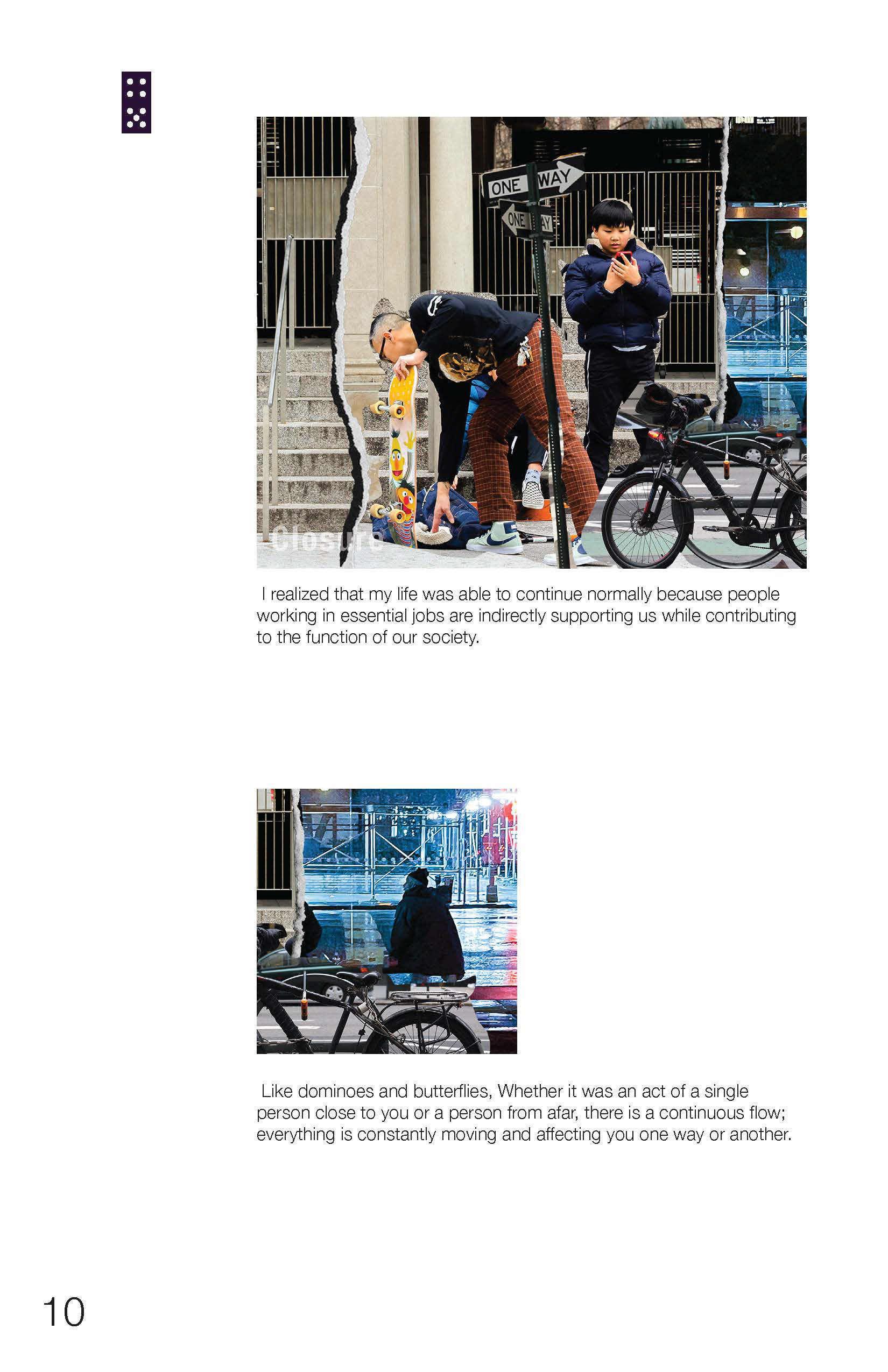
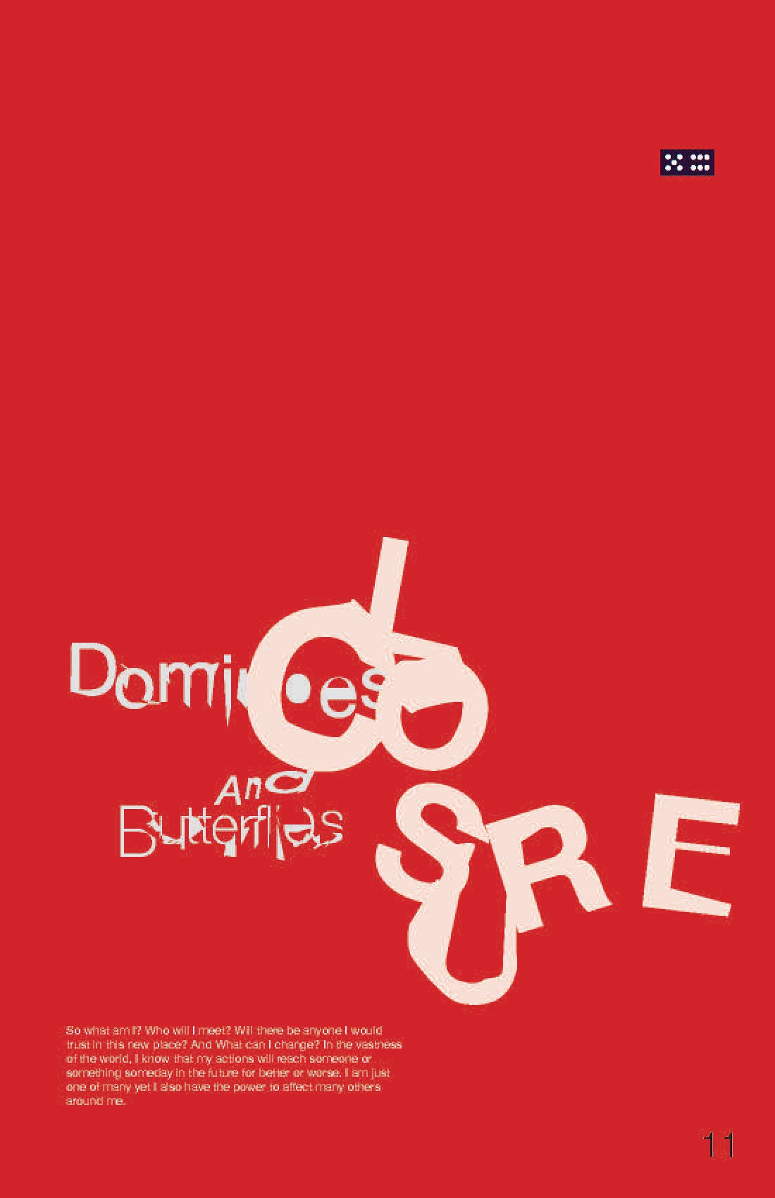
After creating all the elements, I chose a final color theme that helped highlight the images while holding its own graphic elements. I selected some paper textures to help bring out the paper texture while making the whole zine look more “free” like a comic book.

Final Spread Design:
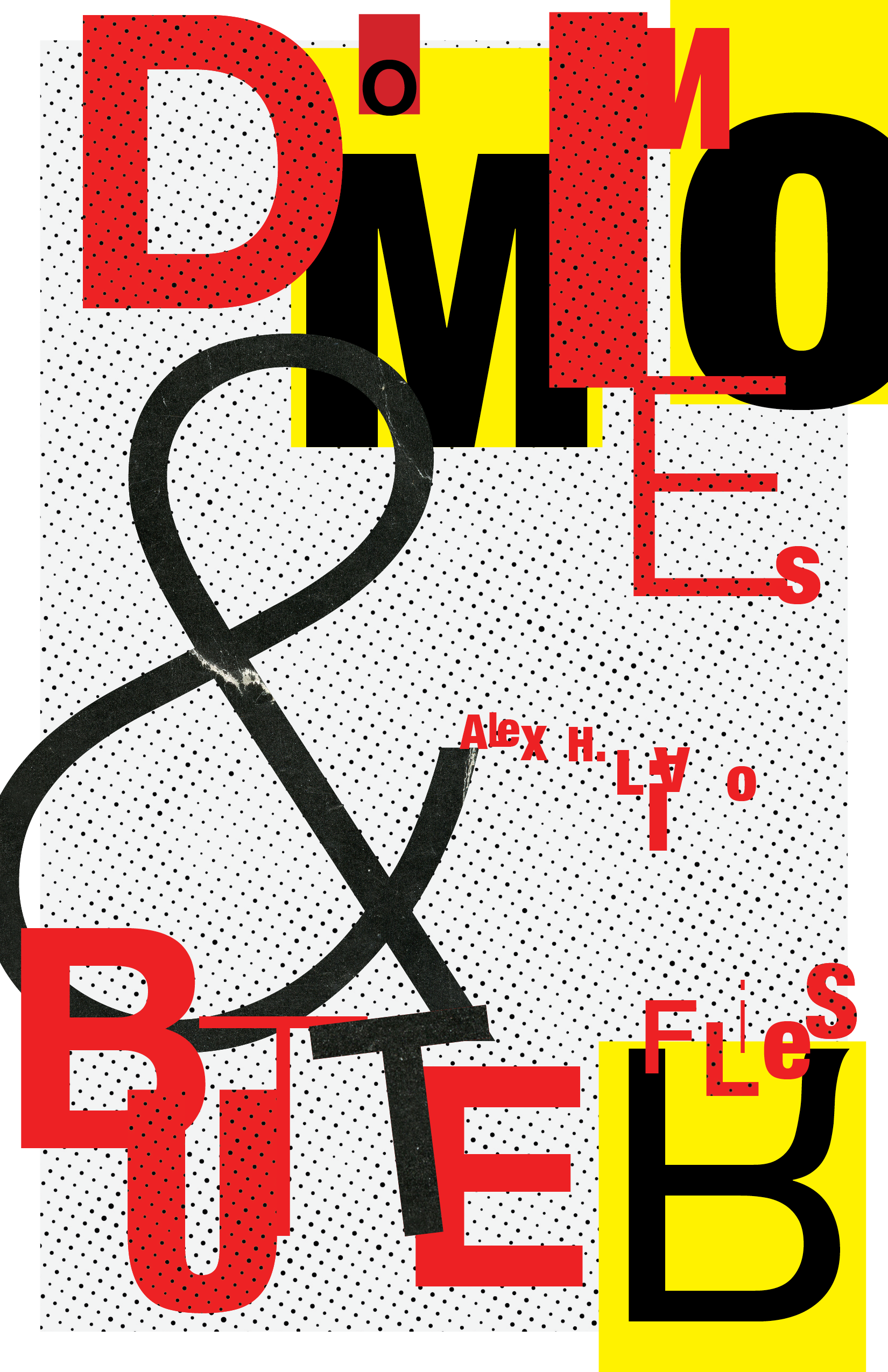
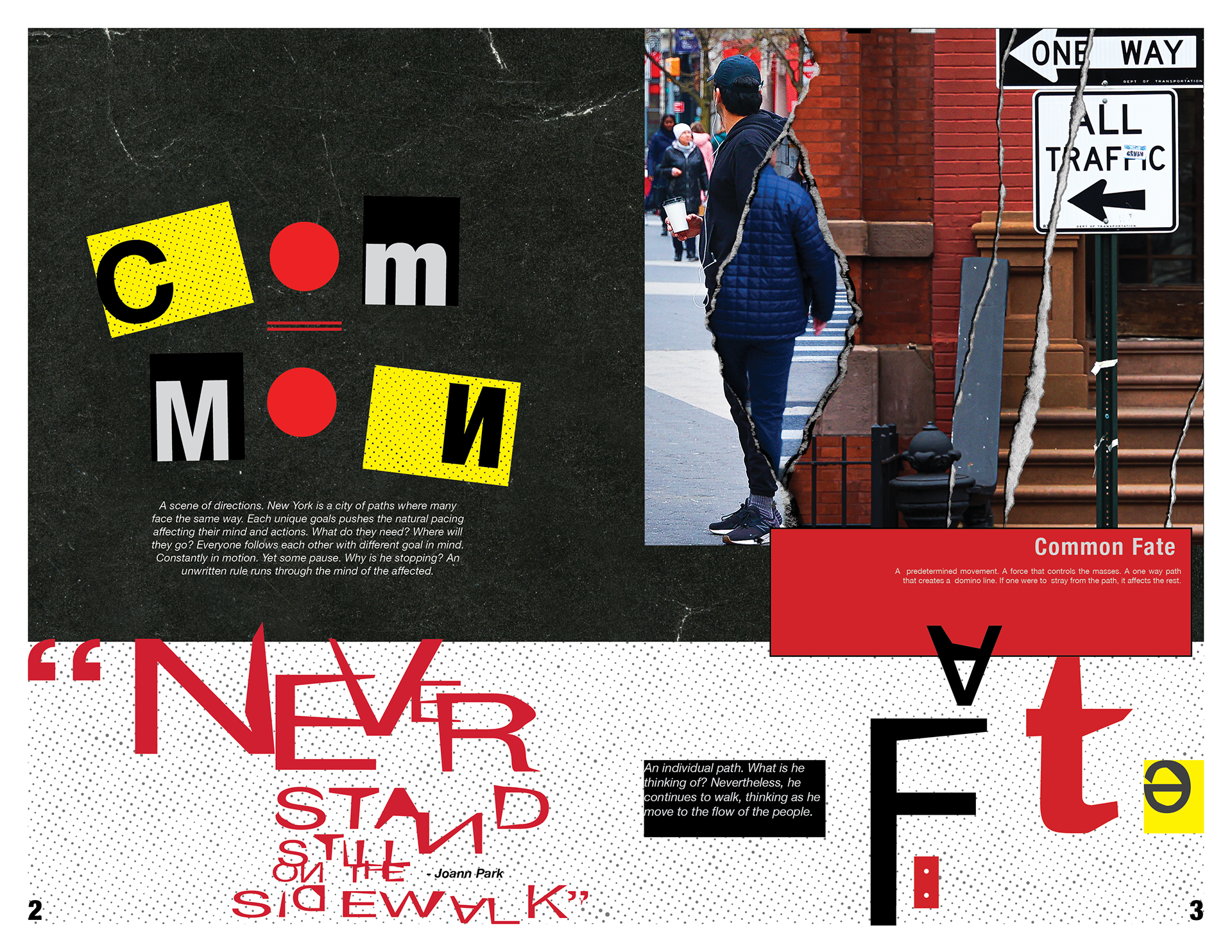
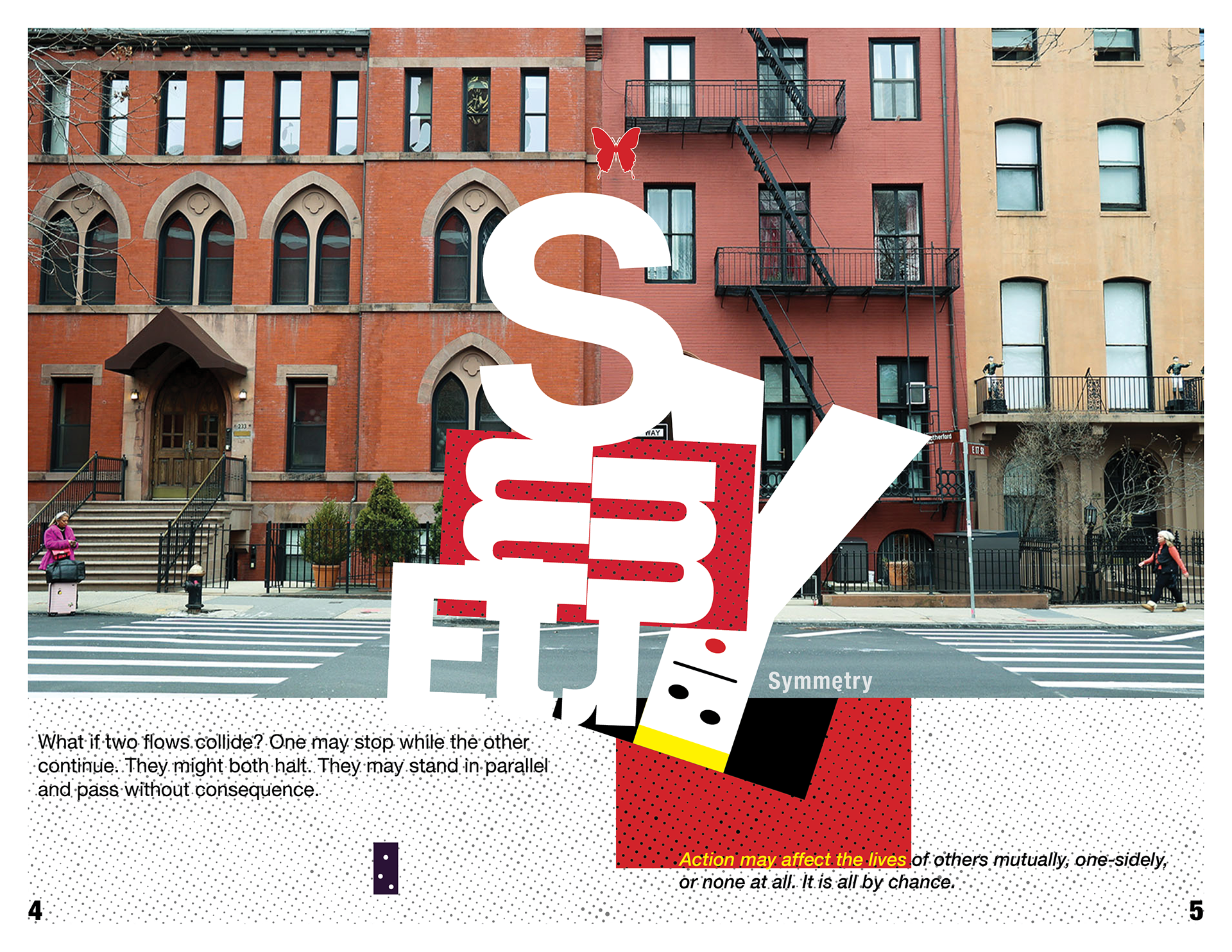
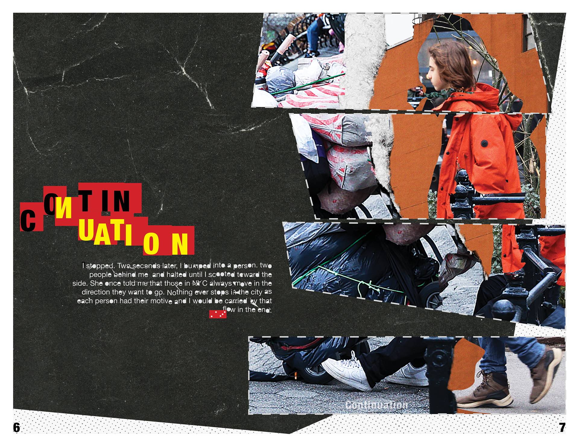
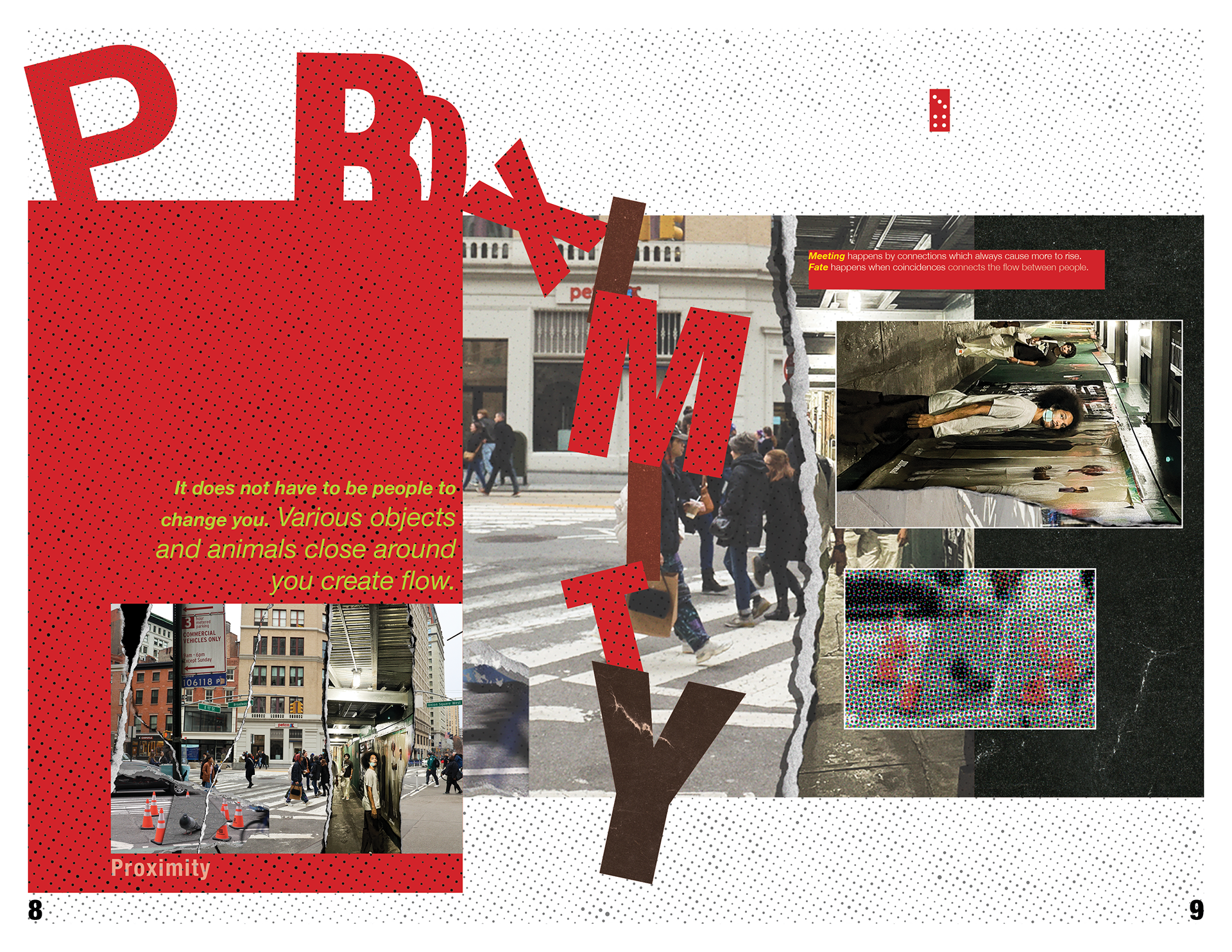
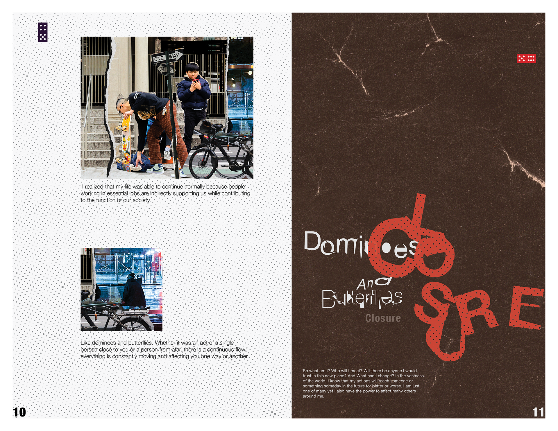
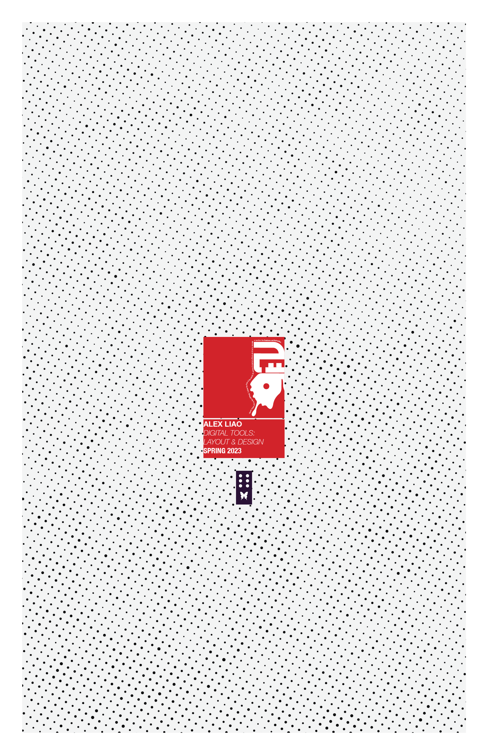
Later on, I used the Colorplan | Natural | 135gsm paper to create the zine as it had a more cardstock feel, making the images less glossy while retaining a rough edge when laser printed.
Printed Images:


After-Notes:
In this last part of the zine project, I learned a lot more about experimenting with typography. I believe what was successful about this project section was the color choice of the overall theme and the playing of text as it helped create a sense of organized chaos throughout the piece. Despite it seeming all over the place, it was easily readable and had a good flow throughout the pages. One challenge I had was with the color theme since the images I had already contained saturated elements so it was hard to find a combination that helped complement the images while making it seem more like a graphic magazine. When some things didn’t work out, I started to go back to the references and play around with text and shapes until I was satisfied with the layout. The most satisfying part of this section of the project was the paper textures I added since they elevated the matte texture of the zine paper I selected while containing a comic, half-tone pattern that I like to see.