Main Logos
To start the logo design, I focused on using around 10 vocabulary words to help define the overall look of my brand logo.
Branding Attributes:
- Precise
- Efficient
- Honest
- Simplistic
- Impactful
- Modern
- Organized
- Trustworthy
- Playful
- Cultural
Initial Sketches:
After wording these, I started to design my logo. At first, I used 10 1×1 cubes to create shapes according to my personal letter logo and started to expand them through various shapes. I used the basis of my Korean culture to create logo designs that use both the initials of my English name and my name in Hangul. For my material choice, I decided to use an ink brush as it is my favorite drawing tool and was also used in my cultural history.
Variations:
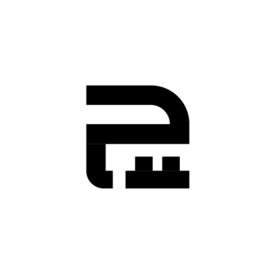
After selecting my design, I moved on to variations of my designs. I decided to go with the design (arrow pointed) as it showed a simplified version of my initials and also a rotated 료 (my last name written in Hangul). For this section, I shifted around and rotated certain elements of the logo to create new compositions until I was able to decide on my design.
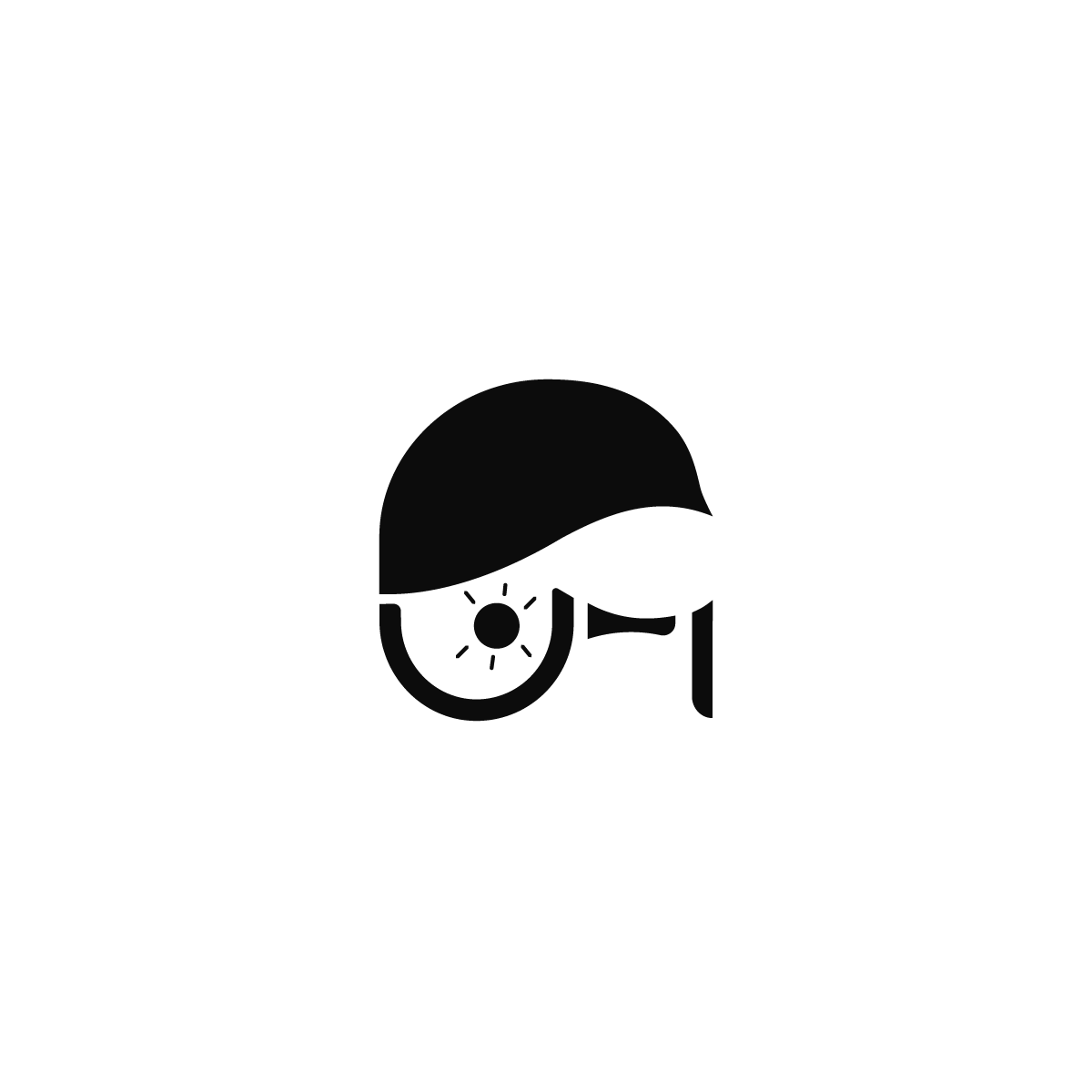
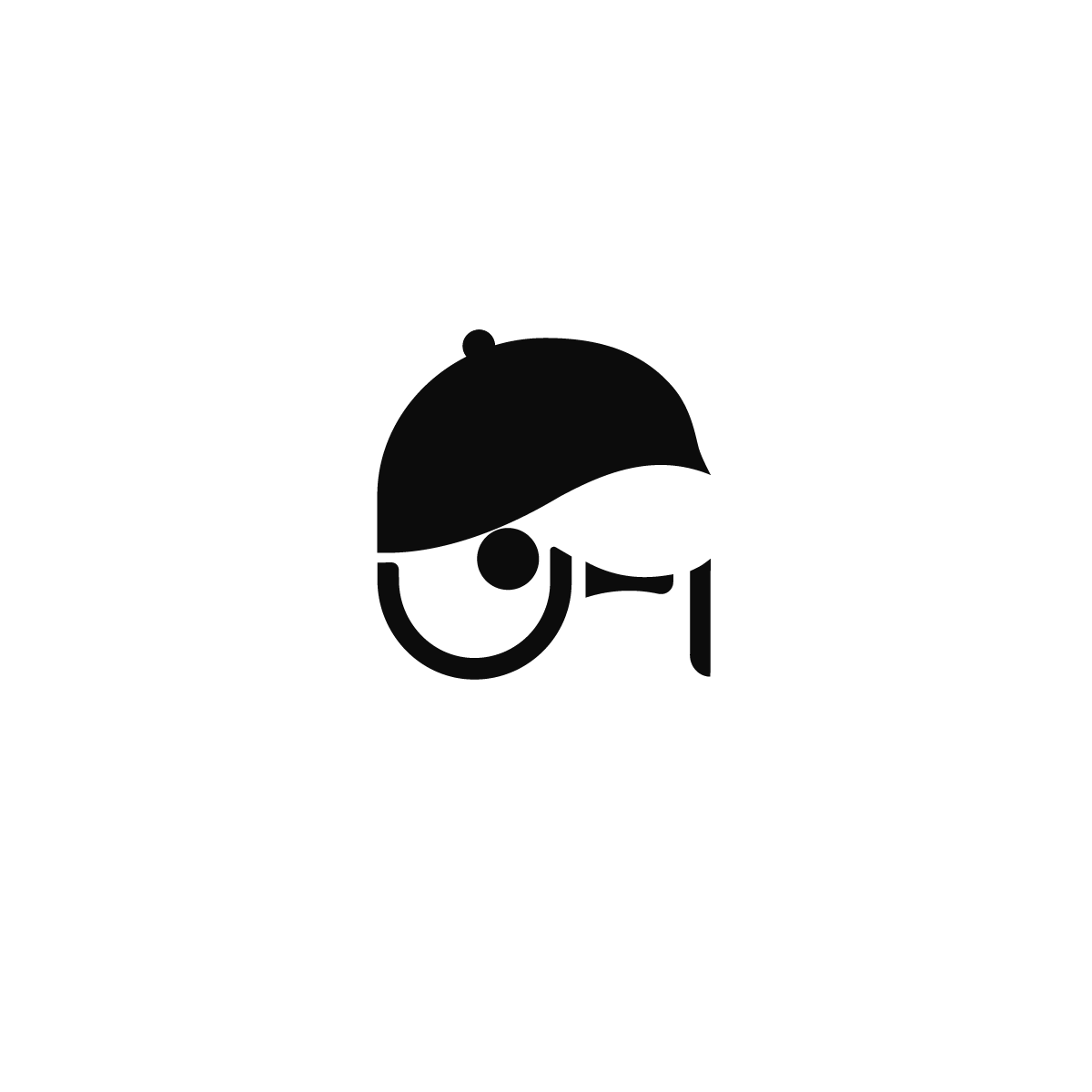
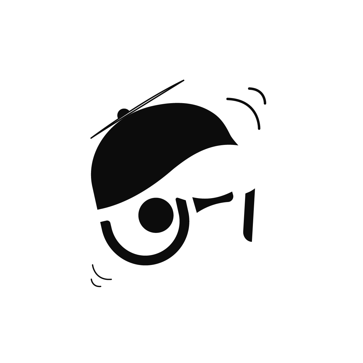
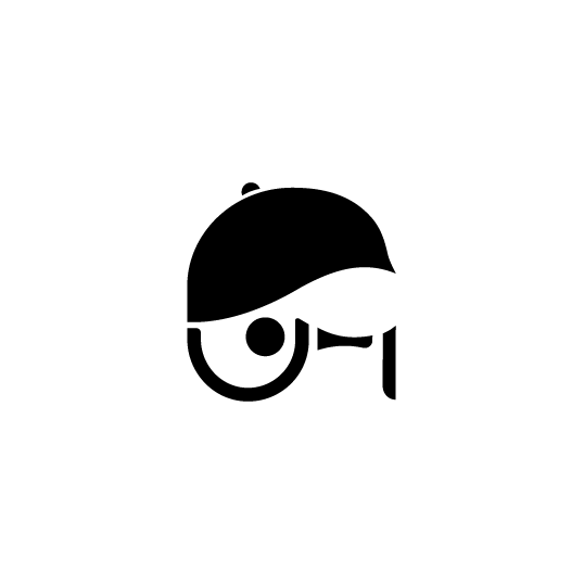
I wanted to design an illustrative logo that would best help represent me while maintaining a similar look to my letter logo. I decided to focus on creating a portrait of myself while simplifying the shape design to a more sleek look. For this section, I used negative spacing to form my golf hat with hooks comprising my glasses.
Storyboarding/Finalization:
Moving on to the next stage of the project, I created a storyboard design for the logo animation where my letter logo would transition into my illustrative logo. To do so, I sketched out my storyboard and took note of transitions and elements I planned to create in each frame:
Eventually, I drafted a cleaner design in Illustrator. I experimented with shaping through grids to help align negative spacing to a 1.5-inch width that follows the stroke length. For the illustrative logo, I traced it using the pen tool and started to smooth out the shape with pathfinder and anchor tools.
Draft Designs:
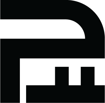
Draft Letter Logo

Draft Illust. Logo
I started to realign some parts to create more even spacing between shapes and altered strokes to make the 료 character more appealing.

Final Letter Logo

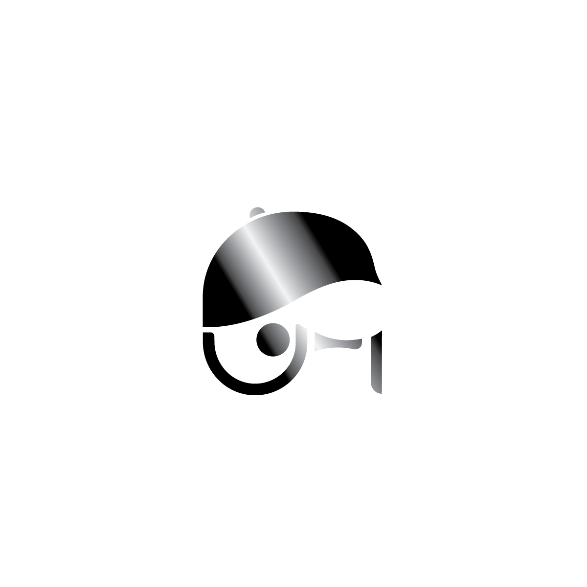
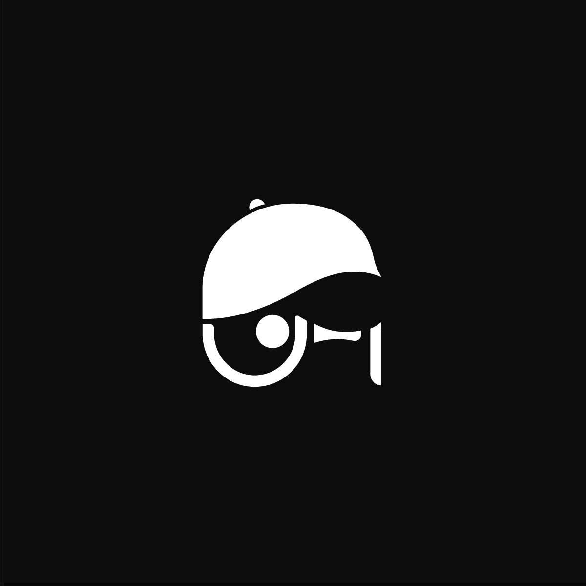
Final Illust. Logo
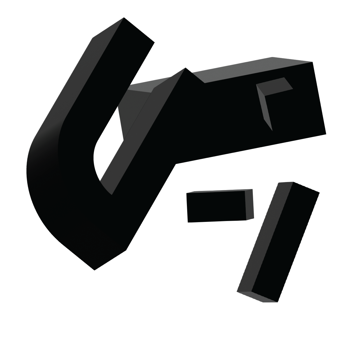
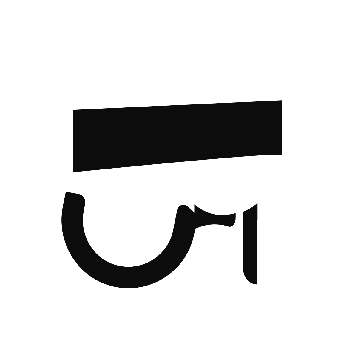
For the storyboard, I digitalized my storyboard sketches into various artboards with parts I plan to create when I move on to Photoshop Timeline. I added some more frames to the initial storyboard in order to better visualize my process.
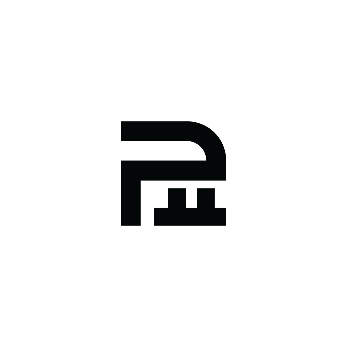
1
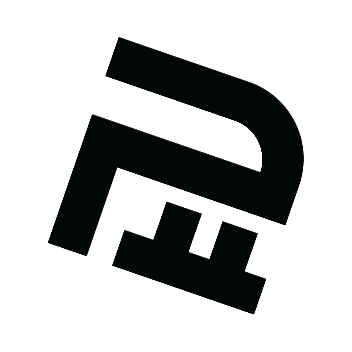
2
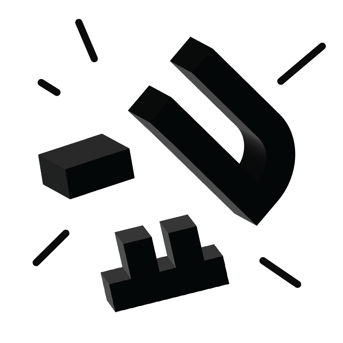
3
4
5
6
7
8
9
10
I converted these artboards into images to use as a frame for the animation. In Photoshop, I arranged and tweened some frames to help better morph some shapes and exported them into a gif.
Final Rendering:
After creating this gif, I converted each shape into an illustrator file and imported them through Aftereffects. It took a while to separate each layer as I had to organize them in a way where I could align each shape of the logo with its partnering shape in the illustrative logo.
I researched several YouTube videos to help me understand more about smoother shape transitions during the process while working with 3D shapes in Aftereffects. I used several Ease-In keyframes and Cinema4d rendering to help create the depth and lighting of the shapes.
Eventually, I made final revisions to the keyframes and rendered a final video.
Final Keyshots/Color-Inverts and Pattern Designs:


Hope You Enjoyed It!